
We recognized that our basic reporting product was a mess and it didn't respond to a user's mental model. Customers were starting to rely more on integrations, or simply churned away. I identified and redesigned the entire module to elevate confidence in customers.
Business objectives
Retain customers of the flagship product
Compete with other POS tools
Simplify, migrate backend & save costs
Reduce support volume of 25%
Product outcomes
Increased CSAT from 56% to ~71%
Adoption across ~72% businesses
Upsell advanced modules
Reduced support calls from 25% to ~13%
Design outcomes
Increased engagement by ~60%
Reduced time to insight by ~40%
Established UXR for ongoing iteration
Ugraded design system
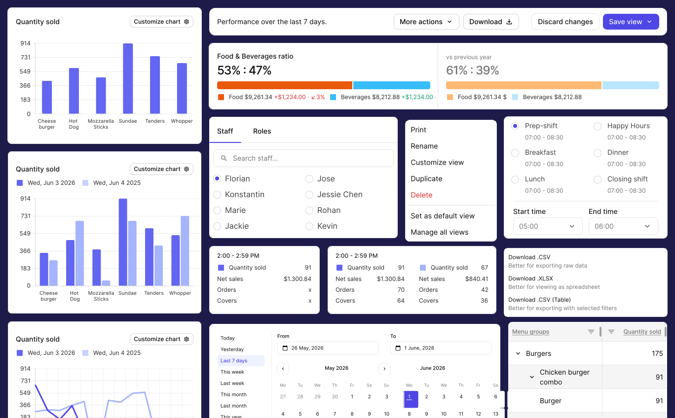
Team's mission: Get software out of the way and then make way for insights
A new team was set up to tackle this large mission with ambitious timelines.

Anurag
Design lead

Mathias
Product Designer

Dominique
Product Designer

Stuart Miller
Product Manager

Peter
Lead Engineer

Liz
Director of Product
Problem space
Lack of UX caused pain & friction
Stories from customers helped us position Benchmarks as a complementary bank, an upgrade Lightspeed's base experience.
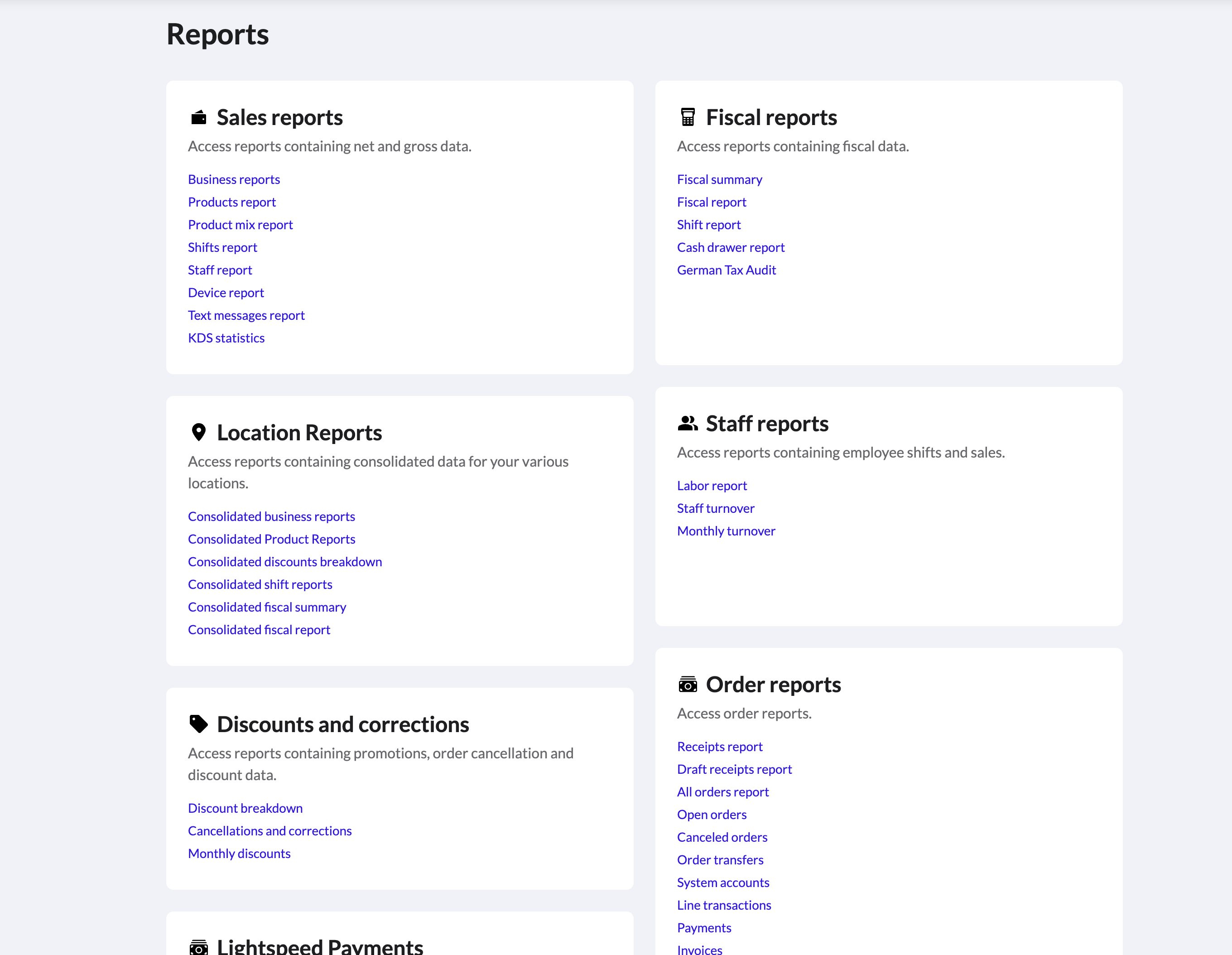
Whopping 37 reports – Information overload
Causing users to frantically dance all over the software
No unifying system – Users not in control
Learn the Lightspeed way of reports or perish
Key insights that helped the team empathize
Stories conveyed pain-points & gave insight into running a business
No one represented users
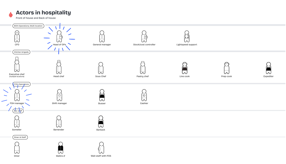
Different roles/archetypes had different needs - owners sought high-level KPIs while managers need depth
Users did not wait for a better tool
People who need insights didn't bother using the system, instead hired analysts and bought expensive integrations
Diverse set of needs across the globe
QSR vs Fine dine vs Casual - there is no 1 size fits all. Users needed control to decision making
Frustrating UX caused immense shock
System changed without any notice and forced users to catch-up. Demos preached "practice makes perfect"
Confusing metrics and deviations in values
Mixed sources of truth in data-pipelines led to confusion which led to lower trust
Representation of past and present + future
This friday can logically be only compared with the same friday last year for meaningful assessment
Target users
While researching I created an artifact to guide my team. This artifact was first to put users in the driving seat and understand their JTBD. This artifact fed many other projects across the org.
Project mission
Make Lightspeed's reporting suite the primary source for operational truth, drastically reducing the need for manual data reconciliation.
MVP release
Controls to focus on a storyline
To funnel down context of a report
Real world levers made into filters
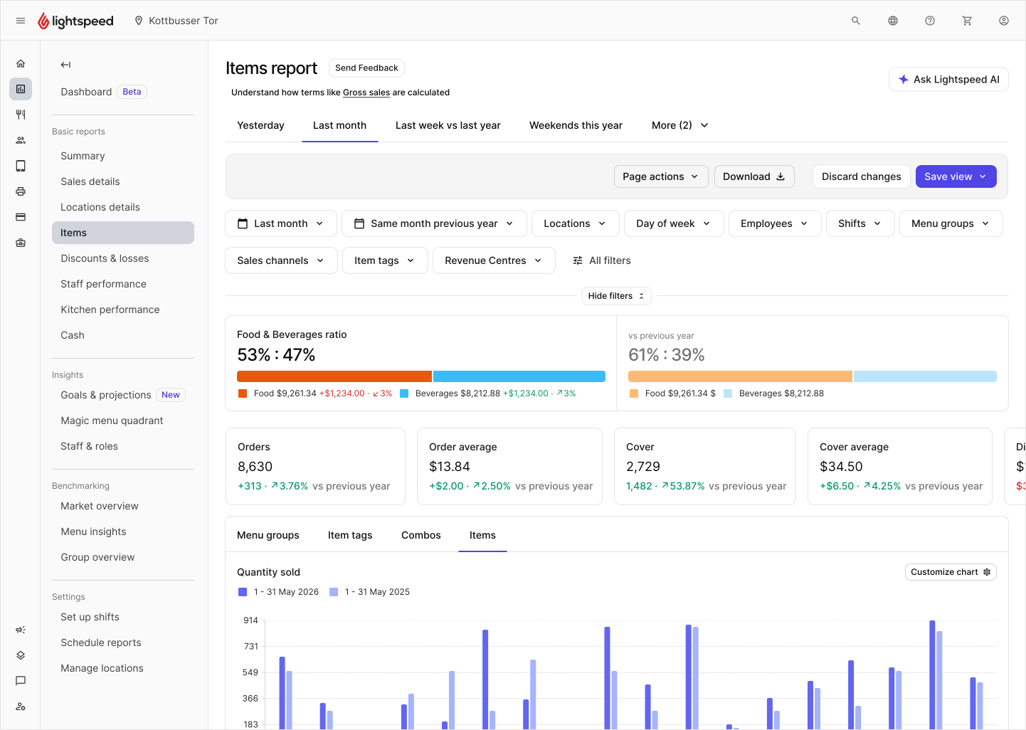
Increased usability + engagement to lift common pain points.
Restaurant data visualized
To spot performance of the business at a glance
Helping analysis of specific storylines
Charts respond to real metrics from a restaurant's business
Comparisons with past performance
To know if this Friday did better or worse than last year
Reducing hours spent
Comparisons applied quickly to save users valuable time
Download storylines with exports & prints
To share storylines with staff to manage operations
Share storylines with others
Formats supported to aid various workflows.
Design framework
Creating a design framework
I created a framework for all reports to follow, and designers then followed this structure to make reports with their teams.
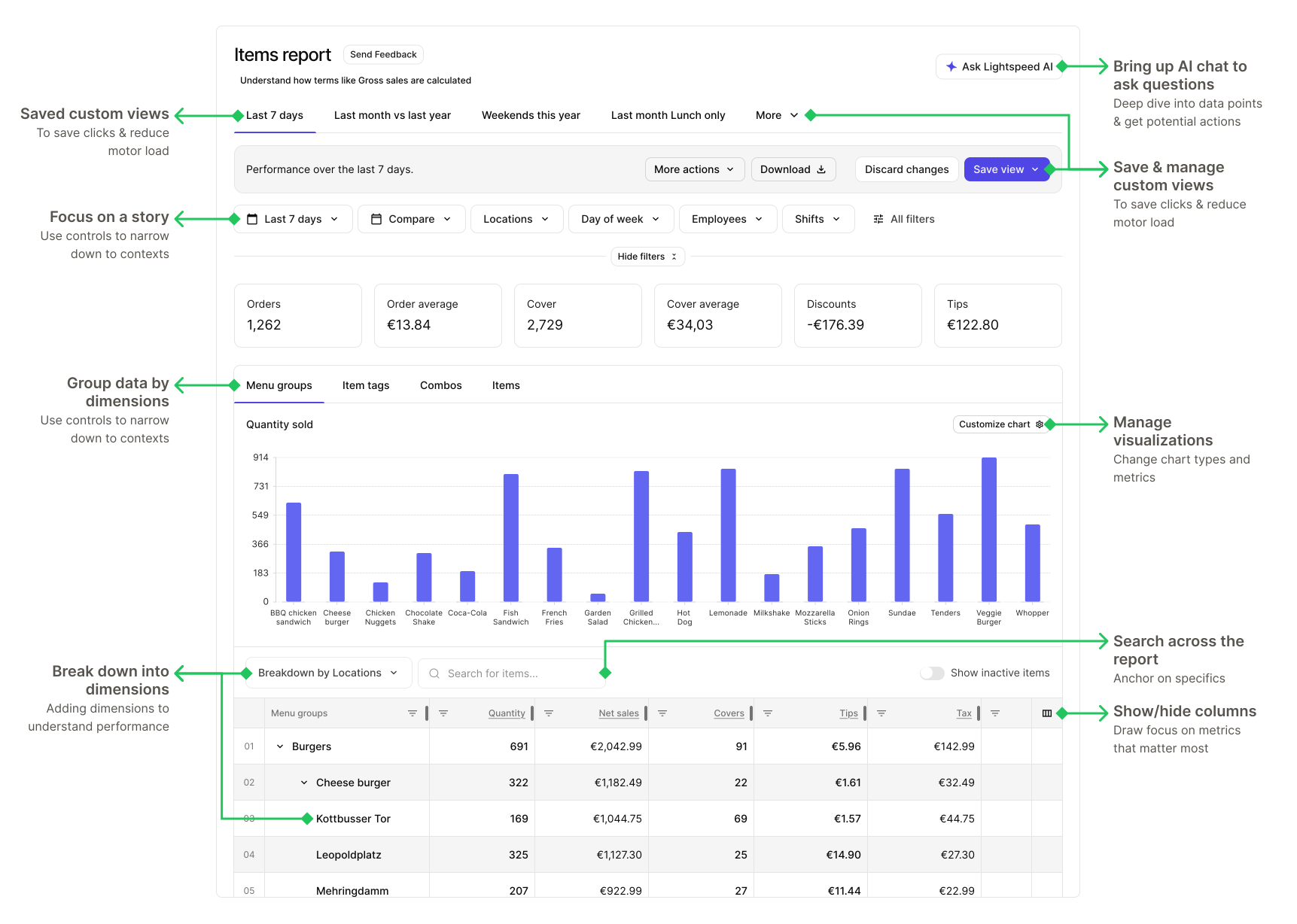
Report framework: Formula for rapid delivery
Solving problems & accelerating product with design framework
This approach freed up ~40% of my team's weekly time from figma production work. Not only did we better manage time, we could reinvest it to more complex projects in the roadmap.
Teams such Kitchen display systems, Reservations, Kitchen displays built their own MVPs using this framework.
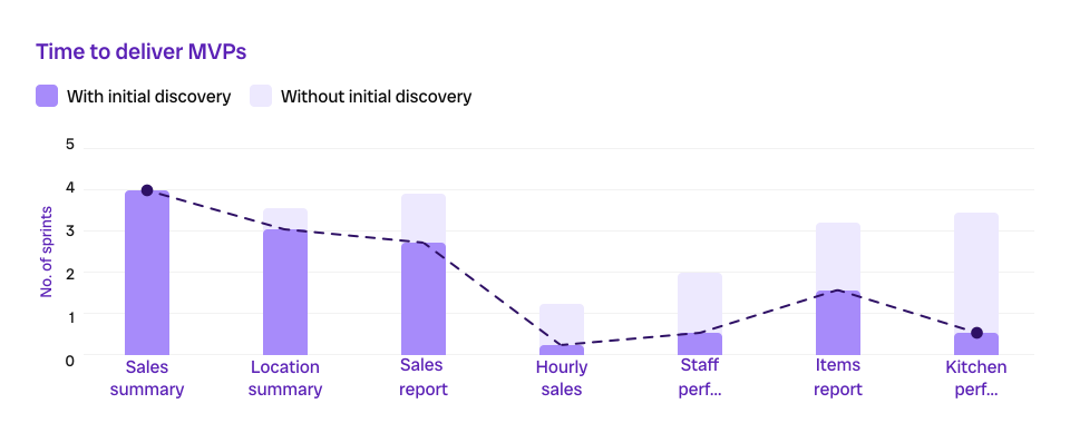
All subsequent deliveries were built using the framework
Trade offs
Concepts that I descoped from the MVP
Based on engineering efforts certain concepts were negotiated
Local managers only
Solving for single location cases first, then multiple locations. Multiple locations could go to 180+.
Schedules, Exports & Prints
Improving interface usability and then enhancing overall experience to reduce dependence on the interface.
Floor plans reporting
Core part of the restaurant operations workflow to assess performance, delivered in V2.
Branch away from org design system
Side-stepping from design system as it created a barrier, so we made our own.
User feedback
We ignited confidence in users
Engagement was up. We measure this by measuring downloads, page visits, CSAT and qualitative data.

This was much needed, we need to download these reports

Sales summary needs a food/beverage split and then it'll be a better report

Great report, we need this to be scheduled in our inbox every week
Product next steps
Integration with PMM, account management & sales engineers
Firefighting mechanism for data discrapencies
Reduce data costs over time and migrate from legacy pipelines
With design set up cross squad collaboration - to serve user needs
Design next steps
Repeated measures of UX metrics to feed iterations
Establishing user panel for UXR and concept testing
Continuous investment in design system + documentation
Help strategize product, design & enginrering roadmaps
Fast-follows
Saved views to accelerate workflow
To quickly view storylines
Reducing time to insight
Users can save their views and come back to them in a couple of clicks instead of starting from scratch
Insights upfront
To get immediate context of the data
Reducing time to insight
Users could view vital information upfront to gauge perform and report upstream
Learnings for design & the team
In this UX overhaul the team has found great lessons
Constant negotiation with eng
Guess work is friction, friction is undesirable. Value of a product is lost if it comes with a user's manual.
Dealing with annoyed customers
In such a wide user-base its near impossible to make everyone happy. Aim for 80% success with UX metrics.
Adapt to design system limits
If a system is not set up to support your vision, bypassing it is fine and the design system can catch up to your work.